|
Most likely you’ve already experienced this design trend on your mobile devices or desktop computers in some fashion. But if you’re not a design-geek, then you may have missed this subtle shift in user interface (UI) and experience (UX) design.
The principles behind flat design are straightforward: simple elements, simple color palettes, more focus on typography and contrast and no extra effects—its minimalism applied to design in tech.
Marci Ikeler, Little Arrows founder and Forbes contributor, wrote, In the late 90s, only a certain class of professional workers was familiar with desktop software, let alone digital interfaces. That meant that we spent a good deal of our time working on making website buttons, menus and links jump out and look very ‘clickable.’ The flat design trend is a symptom of the growing maturity in the field of web and interface design." In short, a digital button doesn't have to look like a physical button any longer.

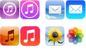
The redesign of Apple’s iOS 7 is notably much more minimal, transparent and graphically flat. iOS 6 and previous operating systems favored the use of skeuomorphic design: heavy textures, stylized apps and 3D elements that were very literal visual representations. Reference the apps Newsstand, Game Center or Contacts as examples of the more literal skeuomorphic design. Craig Federighi, one of Apple's key software heads joked about the previous design: “We ran out of green felt and wood,” although notably it was this design approach that helped make the brand new iPhone (back in 2007) easy to navigate and user friendly, rather than daunting. Learn more about skeuomorphic design here.
The flat design trend didn't originate with Apple. In fact, they may be considered behind the times in this regard. It's been implemented for Windows 8 and Android since its release in late 2012.
Flat UI/UX has arrived. Learn more here and here, or search “flat design” on Dribble, Pinterest or Google, and get lost in flatland.
|

